

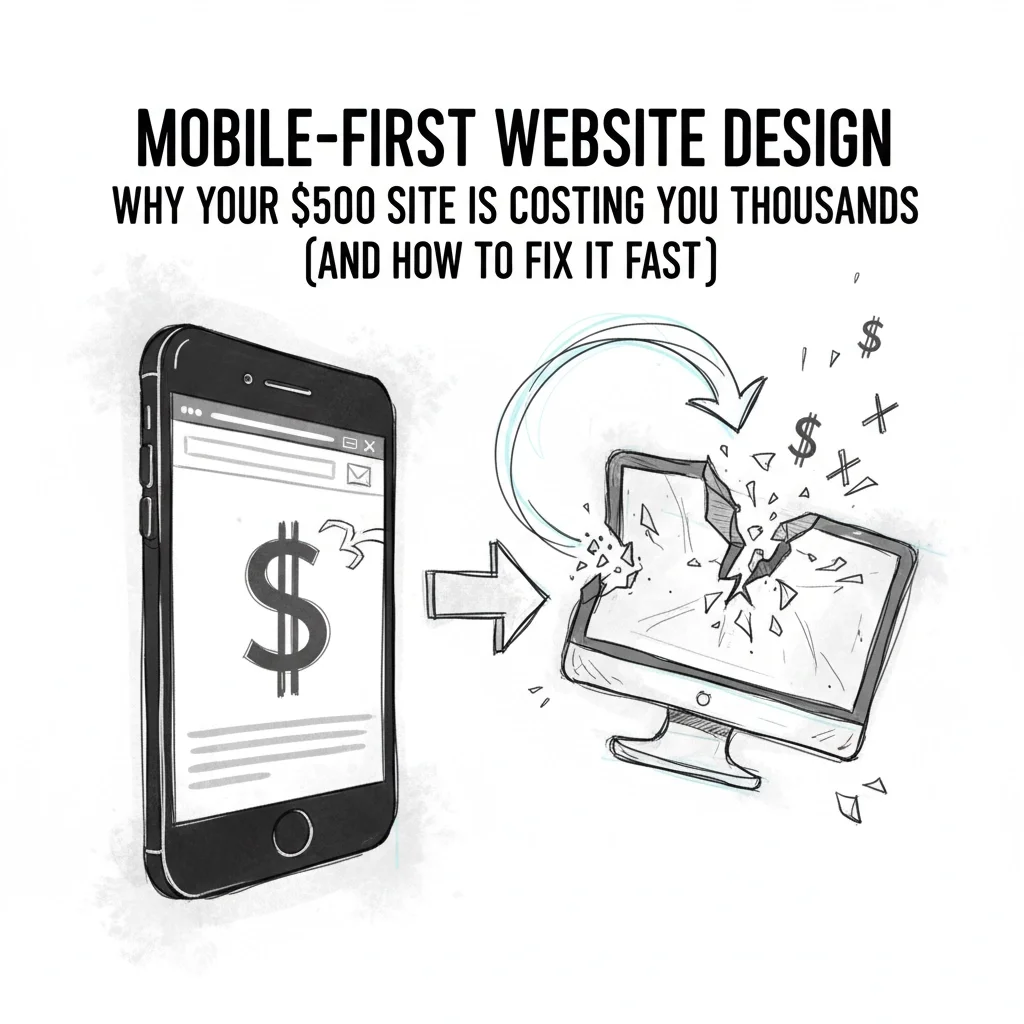
Mobile-First Website Design: Why Your $500 Site Is Costing You Thousands (And How to Fix It Fast)
That bargain $500 website sitting pretty on your desktop? It's bleeding money every single day.
While you're patting yourself on the back for saving cash, potential customers are bouncing off your mobile site faster than you can say "website optimization tips." The harsh truth? Your budget website isn't just failing to convert: it's actively sabotaging your business growth.
Here's what nobody tells you about cheap websites: they're built for yesterday's internet, not today's mobile-first world. And in 2025, that's a death sentence for small businesses trying to grow their online presence.
The $500 Website Trap: What You're Really Getting
Picture this: You hired someone's cousin's friend to build your site. They delivered something that looks decent on their laptop, called it "mobile-friendly," and disappeared into the digital sunset.
Sound familiar?
Budget websites are digital Band-Aids: quick fixes that create bigger problems down the road. They're built with basic tools, outdated templates, and zero consideration for scalability. The code is messy, inflexible, and about as future-proof as a flip phone.

The Reality Check:
Limited functionality out of the box
Minimal room for expansion
Templates that can't handle growth
Poor mobile optimization (despite claims otherwise)
Hosting that crashes under minimal traffic
One local retailer learned this lesson the hard way. Their $600 "bargain" site looked fine until they tried adding more products. The site couldn't handle an expanding catalog, crashed during traffic spikes, and completely disappeared from Google searches for their main products.
They were losing sales daily until they bit the bullet and invested in a proper rebuild.
Why Mobile-First Design Isn't Optional Anymore
Mobile-first design isn't just a trendy buzzword: it's survival strategy. This approach prioritizes essential features for mobile users first, then scales up to larger screens. The result? Streamlined, lightning-fast experiences that actually convert visitors into customers.
The Mobile-First Advantage:
Performance That Pays: Mobile-first development forces lightweight code, compressed images, and efficient caching. Faster load times mean lower bounce rates and higher search rankings. Google's algorithm heavily favors mobile-optimized sites, so this directly impacts your visibility and traffic.
User Experience That Converts: When you design for small screens first, you eliminate unnecessary clutter and focus on what matters most. Touch-friendly buttons, clear navigation, and readable fonts aren't just nice-to-haves: they're conversion drivers.
SEO That Actually Works: Google uses mobile-first indexing, meaning it primarily uses your mobile site for ranking and indexing. A properly optimized mobile-first site doesn't just rank better: it stays visible when algorithm updates hit.

The Hidden Costs of Cutting Corners
Here's where that $500 savings turns into thousands in losses:
Scalability Nightmare: Need to add a blog? Online store? Booking system? Your budget site probably can't handle it without a complete rebuild. You end up paying twice: once for the cheap site, then again for the professional one.
Traffic That Bounces: Slow-loading mobile sites kill conversions. Even a one-second delay in page load time can reduce conversions by 7%. For a business making $100,000 annually, that's $7,000 in lost revenue: every year.
Search Invisibility: Poor mobile optimization tanks your search rankings. If you're not on the first page of Google, you might as well not exist. The difference between ranking #1 and #10 can mean thousands in lost monthly revenue.
Customer Frustration: Nothing screams "unprofessional" like a website that doesn't work on phones. In a world where 60% of searches happen on mobile devices, a non-responsive site is business suicide.

The Real Numbers Behind Mobile Optimization
Let's talk data that'll make your accountant weep:
Mobile traffic accounts for 54% of all web traffic globally
73% of users will leave a site that takes longer than 5 seconds to load
Mobile-friendly sites see 67% higher conversion rates
Businesses with mobile-optimized sites are 74% more likely to convert visitors
Still think that $500 site is saving you money?
How to Fix Your Website Fast (Without Breaking the Bank)
The good news? You don't need to mortgage your house to get this right. Here's how to transform your mobile experience and start capturing those lost conversions:
Step 1: Audit Your Current Mobile Performance
Use Google's Mobile-Friendly Test and PageSpeed Insights tools. These free resources will show you exactly where your site is failing mobile users. Common issues include:
Slow loading times (anything over 3 seconds is too slow)
Text too small to read
Buttons too close together
Content wider than screen
Unplayable videos
Step 2: Prioritize Essential Content
Mobile-first design forces you to focus on what matters most. Strip away the fluff and highlight your core message, primary call-to-action, and contact information. If it's not essential for conversion, it doesn't belong above the fold.

Step 3: Optimize for Speed
Compress images without losing quality
Minimize code and eliminate unused plugins
Enable browser caching
Choose reliable, fast hosting
Use a content delivery network (CDN)
Step 4: Design for Touch
Make buttons at least 44x44 pixels (Apple's recommended minimum touch target). Space interactive elements apart. Use contrasting colors for call-to-action buttons. Test everything with actual fingers, not mouse clicks.
Step 5: Future-Proof Your Investment
Work with developers who understand affordable website design principles but don't compromise on mobile optimization. Look for clean, extensible code that can grow with your business. Ask about their mobile-first development process and request to see examples.
The Professional Difference
Professional web developers approach mobile-first design with long-term vision. They consider whether your site might evolve into an e-commerce platform, need multi-language support, or require integration with booking systems and customer portals.
Quality development means:
Clean, semantic code that's easy to modify
Responsive design that works on all devices
Performance optimization built in
SEO structure that supports growth
Scalable architecture for future needs

The investment pays for itself through higher conversion rates, better search rankings, and the ability to adapt as your business grows.
Your Next Move
Every day you wait, you're leaving money on the table. Those potential customers landing on your site from mobile searches deserve better than a broken, frustrating experience.
The difference between a $500 website and professional mobile-first design isn't just upfront cost: it's the thousands in lost revenue, failed conversions, and eventual rebuild expenses that budget sites inevitably generate.
Ready to stop hemorrhaging money through poor mobile experience?
The time for Band-Aid solutions is over. In 2025's mobile-first world, your website either converts or it costs you. There's no middle ground.
Your business deserves a website that works as hard as you do: on every device, for every customer, every single day.
Don't let a $500 mistake cost you thousands more. The mobile-first future is here, and it's time to run with it.